St. Jude Dream Home 2024: Chic Modern Beach Style in CO Springs!
Mark your calendars and check your bank accounts because the 2024 St. Jude Dream Home Giveaway in Colorado Springs is in full swing!
In case you haven’t heard, the St. Jude Dream Home Giveaway is a raffle ticket contest that takes place annually in major cities across the country. All proceeds raised in each Dream Home Giveaway Contest are used to make sure that the families and patients of St. Jude Children’s Research Hospital never have to pay for their life-saving treatments.
It’s really that easy - buy a raffle ticket to support the life-saving work done at St. Jude Children's Research Hospital AND be entered for a chance to win a brand new home at the same time!
Shop all 2024 Colorado Springs Home Furniture
Contest Information
Tickets
Tickets for the event have been for sale since April 17th and are selling out fast, so make sure to get your ticket while you can!
- The grand Dream Home Giveaway is on Wednesday, June 26th.
- The winner will be announced live on KKTV 11 News.
Open House Tours
Open house tours of the home started on June 1st. The open house tours are the perfect opportunity to explore this stunning home, and while you’re there you can also enter your name for a chance to win a $10,000 Furniture Row Shopping Spree!
- The weekend open house tours are from June 1st - June 23rd.
- Times are Saturdays from 10:00a.m. - 5:00p.m. and Sundays from noon until 5:00p.m.
- The winner of the Furniture Row Shopping Spree will be notified via email on June 26th.
Shop the Home Event
But, that’s not all - after the Dream Home Giveaway is all said and done, there’s still a chance to take home something for yourself at the Shop the Home Event! During Shop the Home Event, we sell all the Furniture Row furniture used in the Dream Home at a discount!
- Shop the Home is open to the public and takes place on July 13th from 9:00a.m. - 1:00p.m.
You can also browse the full collection of furniture featured in this year's Dream Home without leaving your seat by clicking the link below!
Shop the Furniture in This Home
About the Dream Home
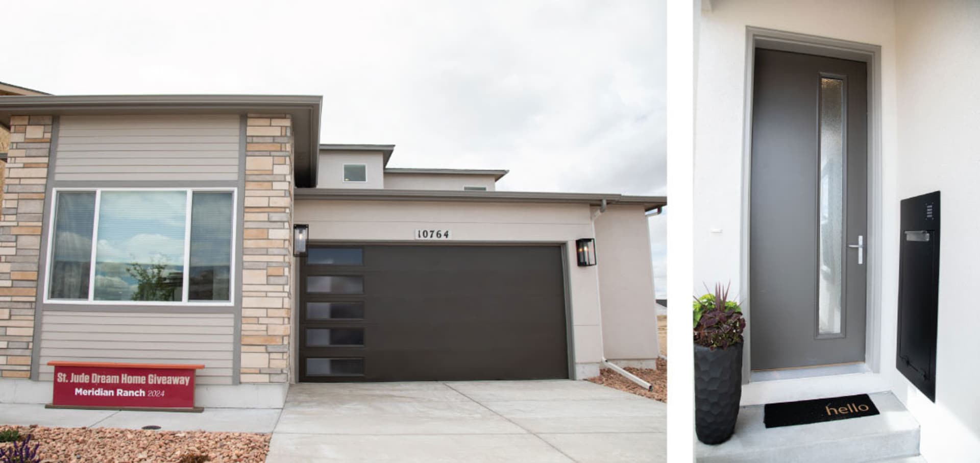
This year's stunning, brand new Dream Home - proudly constructed and donated by Covington Homes - is located at 10764 Rolling Ranch Drive in Peyton, Colorado. Valued at an impressive $775,000, the home boasts 3,700 sq ft of finished living space, complete with 5 bedrooms, 4 bathrooms, and a comfortable 2-car garage. The home is situated within the heart of Meridian Ranch in the charming Rolling Hills Ranch neighborhood, offering the winner not only a beautiful home but a vibrant and thriving community.
The home features an expanded gourmet kitchen with quartz countertops, making it perfect for entertaining. It also features a covered backyard patio as well as an open upstairs balcony so you can enjoy Colorado’s beautiful weather any way you like. The local community also offers a host of amenities, including access to the Antler Creek Golf Course, Madera’s Grill & Cantina, the Community Rec Center, and 500 acres of parks, trails, and open spaces. Shopping and dining options are also conveniently located in the community, and neighborhood schools can be reached on foot.
The Design of the Dream Home
Furniture Row has been partnering with St. Jude Children’s Research Hospital since 2011. Every year our interior designers get the chance to decorate the newly-completed Dream Homes across Colorado with brand new furniture from Furniture Row so that the homes can look their best for their upcoming open house tours.
This year, the home was designed by Grace Covington of Covington Homes, and the interior designer staging the home was none other than our own, Barb Chandler. We were lucky enough to get to interview both women to understand exactly how this stunning home came together. We'll start with Grace's vision for how the home was built, then, we'll go room-by-room with Barb to see how and why she chose each piece.
Here’s Grace Covington’s vision for the interior of the home:
This Home was inspired by our trip to Miami Beach where we fell in love with this “modern beach” look that we saw in homes and lofts in the city. It’s this blend of warm, earth-toned colors mixed with stark modern blacks and glossy whites for contrast. It’s this kind of modern, urban-beach vibe that’s both laid-back and upscale at the same time.
So, we tried to keep in mind this “Miami modern beach” idea when building the home, and you can really see it in the color combinations we used, from the walls and flooring to the appliances, faucets, and tiling.
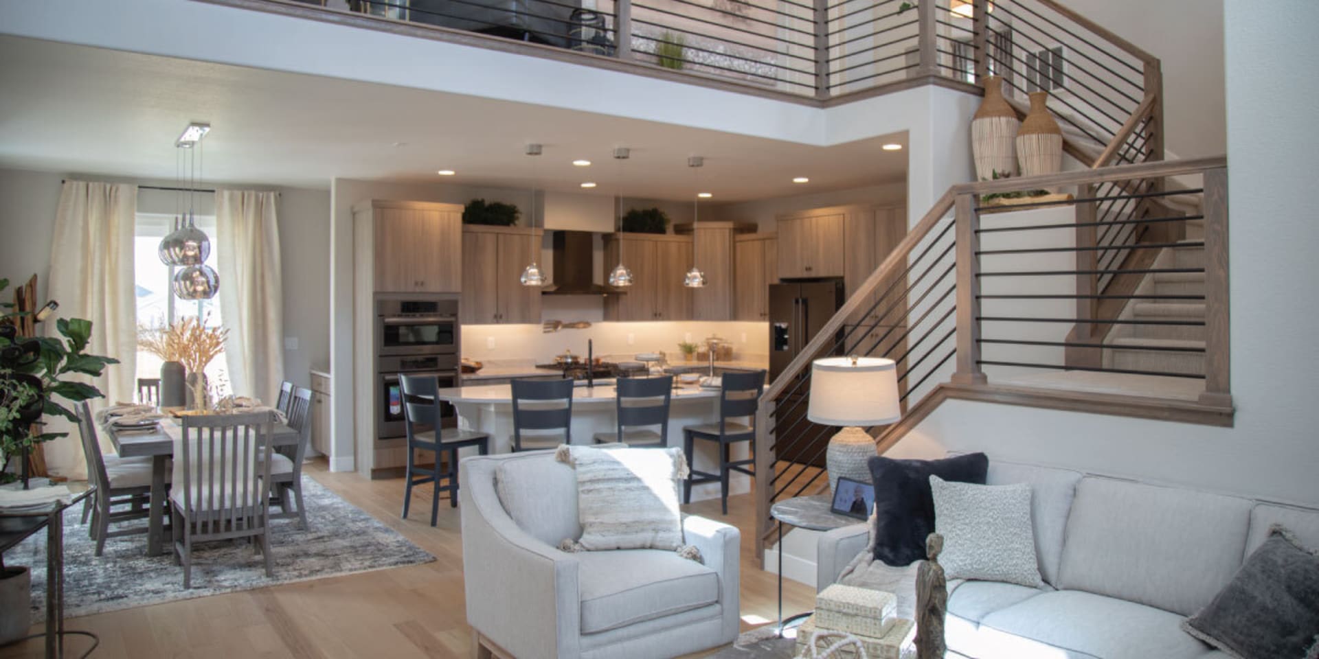
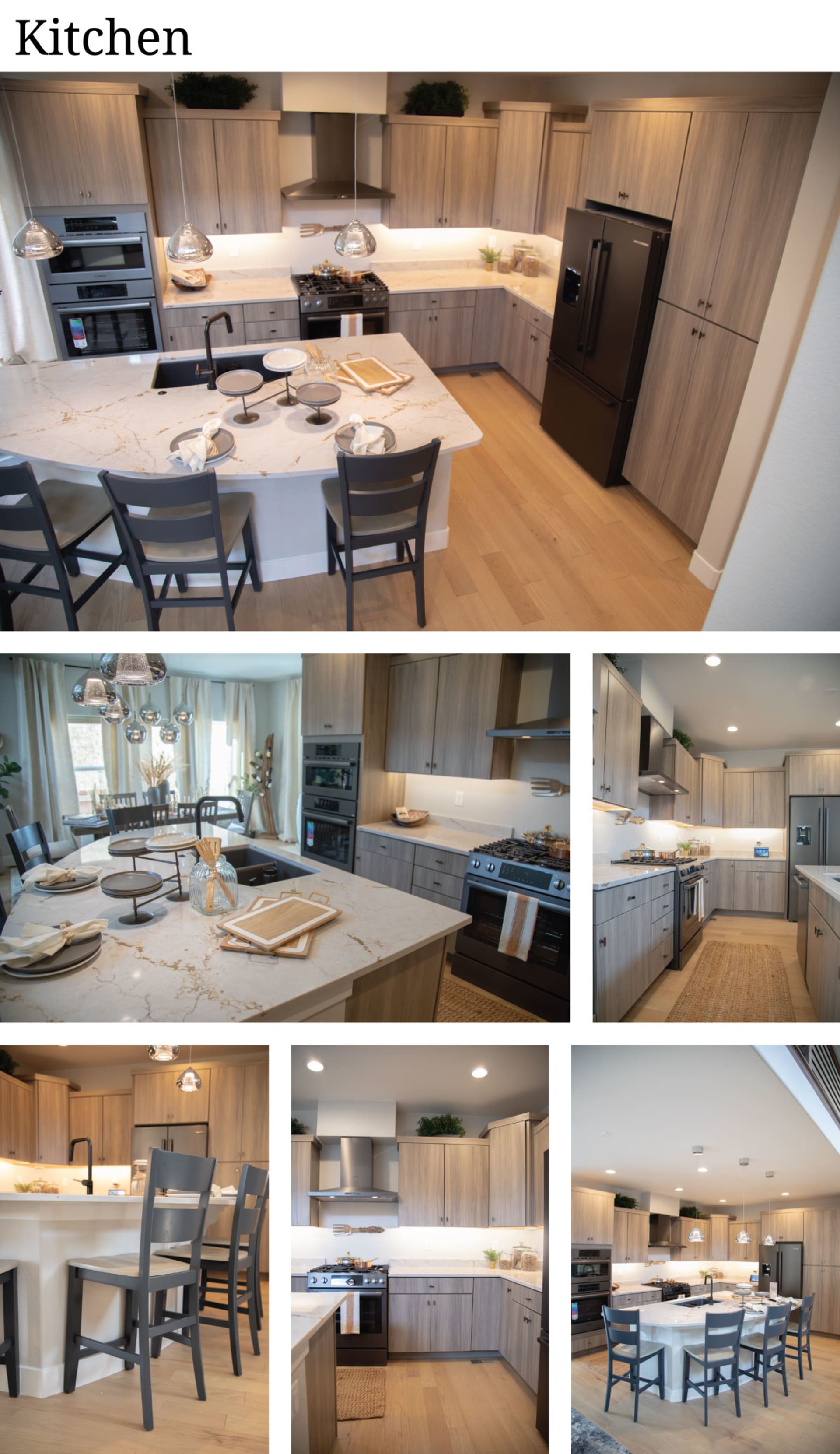
The main floor is an open-plan space with different types of light-colored wood used from the flooring and cabinets to the railing of the staircase, all surrounded by creamy neutral walls for a warm beachy feel. The kitchen area features a brand new line of quartz countertops from Constantino which have both black and gold highlights - a perfect modern addition to this home, and then it also features black stainless steel hardware and appliances which is all really crisp and clean. So that Miami modern beach contrast is all right there from the natural, earthy floors and cabinets to the modern, black-and-white kitchen.
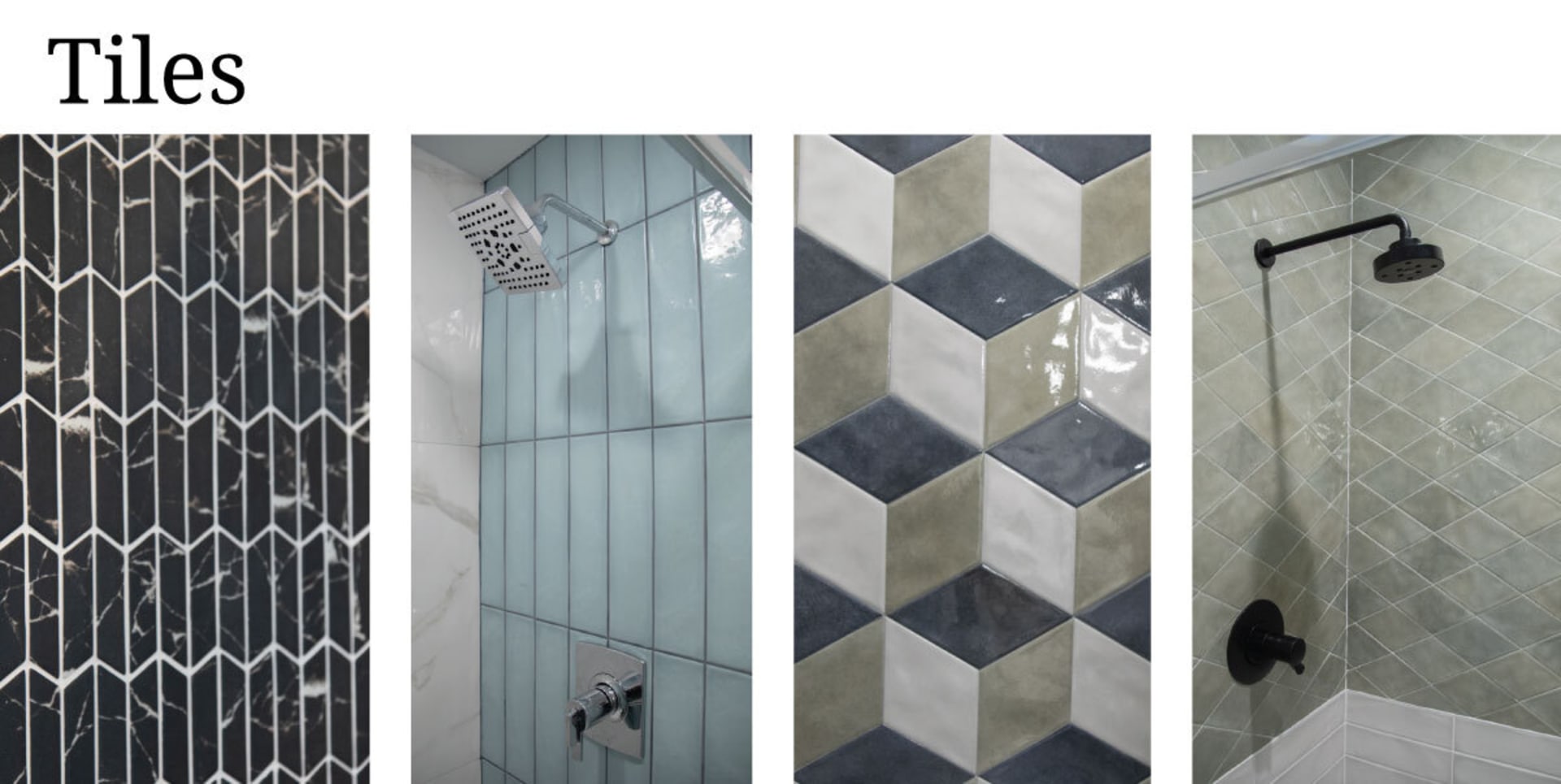
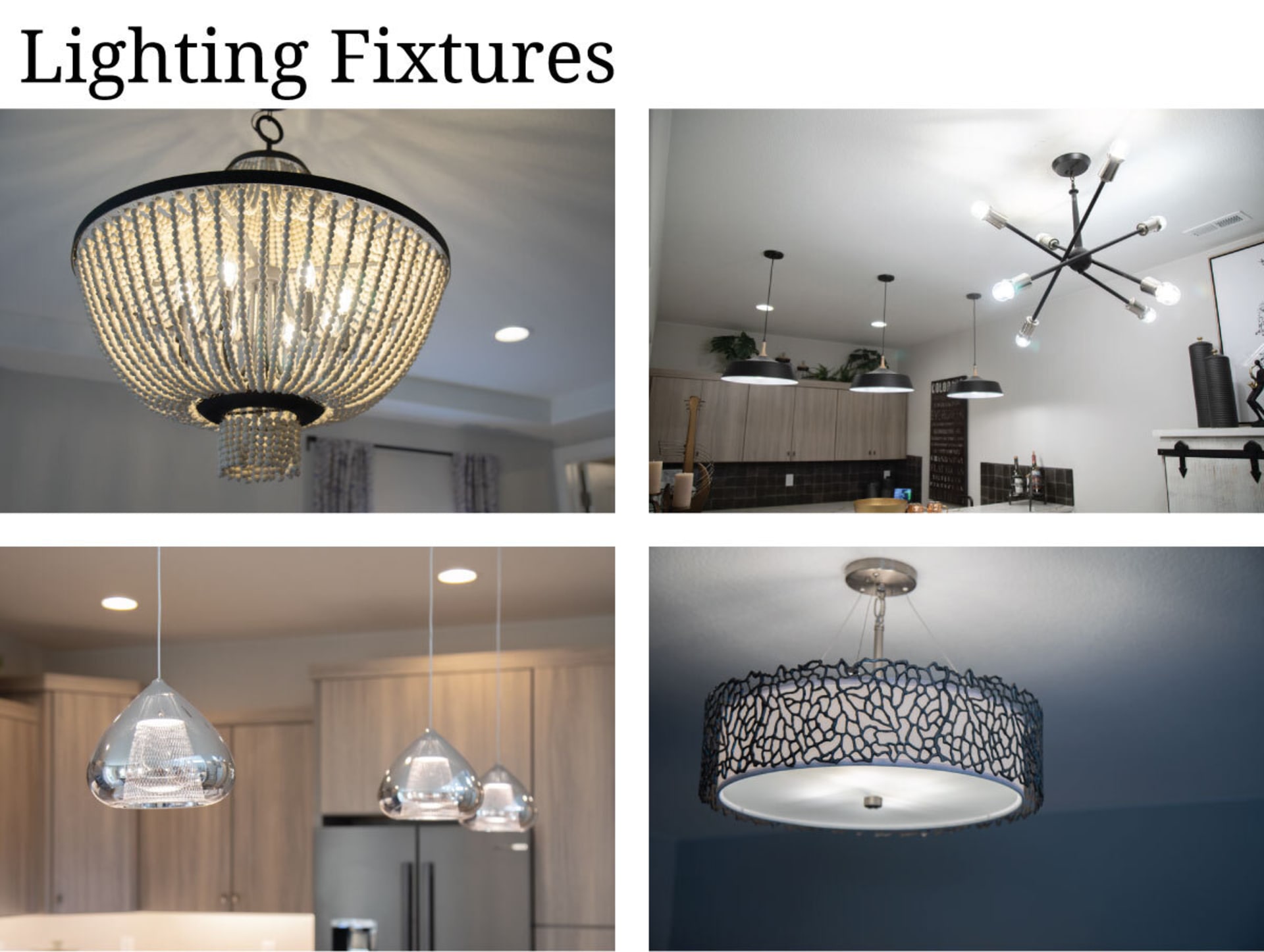
Then, as you continue throughout the home, there’s kind of like a difference of personalities in each of the rooms and floors. So, for example, we have this gorgeous earth toned, textural tiling in the primary bathroom, but then, in the nearby mainfloor bathroom, there’s this stunning combination of white, glossy tiles and light green, diamond-shaped tiles which together feel upscale and elegant. Or, we have flashy, chrome hanging pendants in the kitchen and dining area, then, in the primary bedroom, there’s this fun, inviting beaded wood chandelier. It’s a bit of a difference in every room you enter, but it all works within that modern beach theme.
How We Styled the Home To Match the Modern Beach Theme
In what is quickly becoming a new tradition for the St. Jude Dream Homes in Colorado, our own Furniture Row Designer, Barb Chandler, also sat down to talk with us to talk about her thought process as walked through the home and selected furniture for each room.
Here’s Barb’s room-by-room walkthrough of the 2024 Dream Home in Colorado Springs:
First of all, I absolutely love the Miami modern beach vibe in this home - it’s a great mix of laid-back, beachy, coastal style mixed with touches of upscale, modern, and even urban influences. It’s a unique look that we are actually seeing become quite popular in homes today.
After seeing the interior of the home, I knew I had to find furniture that blended a laid-back, beach feel with hints of the sleek, modern, upscale aesthetic found in urban Miami. It’s a unique juxtaposition of styles, but I was excited to lean into because, at the end of the day, this style is really all about creating a relaxed, welcoming atmosphere that’s also full of sophisticated touches - and the furniture at Furniture Row is perfect for that!
What Barb Looked For to Find the Perfect Furniture
The home’s “Miami modern beach” look is really a blending of what I call natural/beach design elements with modern/urban design elements. (Design elements can be anything from the furniture’s color palette to the shape and accents found on its frame, arms, and legs.)
Here’s an overview of what I was looking for when I went shopping:
- To get the natural/beach look: I wanted to find items that featured light, neutral colored upholstery to complement the creamy walls and quartz countertops, but I also needed to find plenty of pieces that showcased wood in as many natural shades and finishes as I could find (or, as many would match the impressive variety found in the home). To add in personality, I also wanted to bring in eye-catching accents and decor in boho, coastal, and casual styles.
- To add the modern/urban look: The folks at Covington did an amazing job adding in a modern/urban element with their use of black stainless steel appliances and glamorous light fixtures. To add the modern/urban element with furniture, I also wanted to find pieces with dark-colored finishes and glamorous construction materials - but knew I had to be sparing with my choices because I love how warm and inviting the interior of this home is, and too many dark colors could detract from that. It was going to be a fun balancing act!
The Finished Dream Home
As soon as you walk in the front door you can see the beachy, coastal, laid-back vibe, mixed with sophisticated modern elements. The warm-neutral walls and the exquisite, rough-cut white tile fireplace instantly give the space a serene, beach-like feeling, especially with all the different types and textures of light-colored wood from the flooring and cabinets to the stairwell. Then, you see the black stainless steel appliances in the kitchen which is paired with chrome light fixtures and those stunning quartz countertops with gold highlights - it’s just really chic and also really inviting.
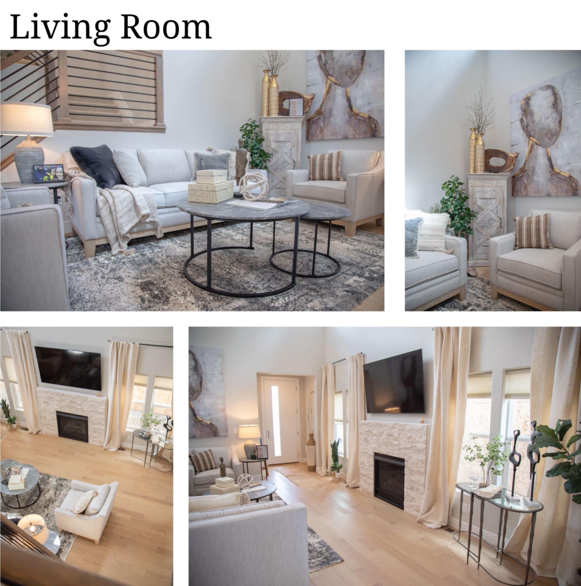
I usually start each room by finding the larger, foundational pieces first. In the living room, I found an absolutely perfect sofa and chair that are brand new to Furniture Row: the Delray Sofa and the Delray Chair.
I love, love, love the fabric on the Delrays and their exposed wood bases. The fabric is very textural with this gorgeous light, creamy color with a touch of gray, and the exposed wood along the base of each piece offers this light sandy finish - these elements combined with the sloping track arms give the Delrays the natural/beach look that works beautifully with the interior of the home.
Once I had the seating in place, I wanted to make sure to bring in a moody, modern element. The Parker Coffee Table and the Parker End Table (Coming soon to Furniture Row!) stood out to me because they have these super-durable tops that look like natural gray stone, plus they rest on minimalist-approved black iron bases. I should also say that round occasional tables like the Parkers are great for modern living rooms that are more narrow in design because they really make it easy to move around!
Dining Room + Kitchen Island
In the dining room and kitchen area, I wanted to get the table and chairs set before I did anything else.
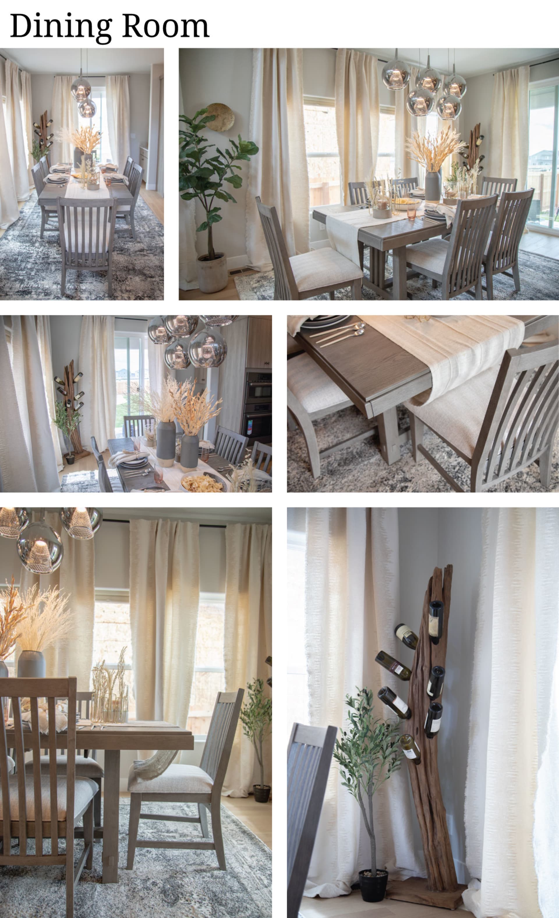
At first glance the Solano 5 Pc. Dining Set might appear like a typical rustic or farmhouse dining set, but the chairs are upholstered with a creamy white fabric and their slatted backrests extend past their seats, making them both sophisticated and intriguing - plus the whole set is finished in a light taupe color with gray and brown undertones, perfect for the home’s natural/beach color palette.
The large kitchen island counter space next to the dining area is also designed for eating, which means the main floor has two dining spaces quite close to each other. To navigate this, I thought it could be a cool idea to double down on the contrast theme found in the home, so I brought in Merrill Creek Bar Stools which are almost the opposite of the Solano Dining Chairs. They are tall with horizontal ladder backrests in a dark, almost black finish which instantly makes them feel more modern.
Primary Bedroom
I really love the light fixtures throughout the home, but the one in the primary bedroom is a little different because it’s made with these little boho wooden beads. The chandelier gives this space more of a natural feeling than the other rooms on the main floor, especially when combined with the earth-toned tiles in the primary bathroom - it just felt particularly relaxed and organic, so I definitely wanted to lean into that by using less of the dark, modern color palette and more pieces with a natural and boho-inspired look.
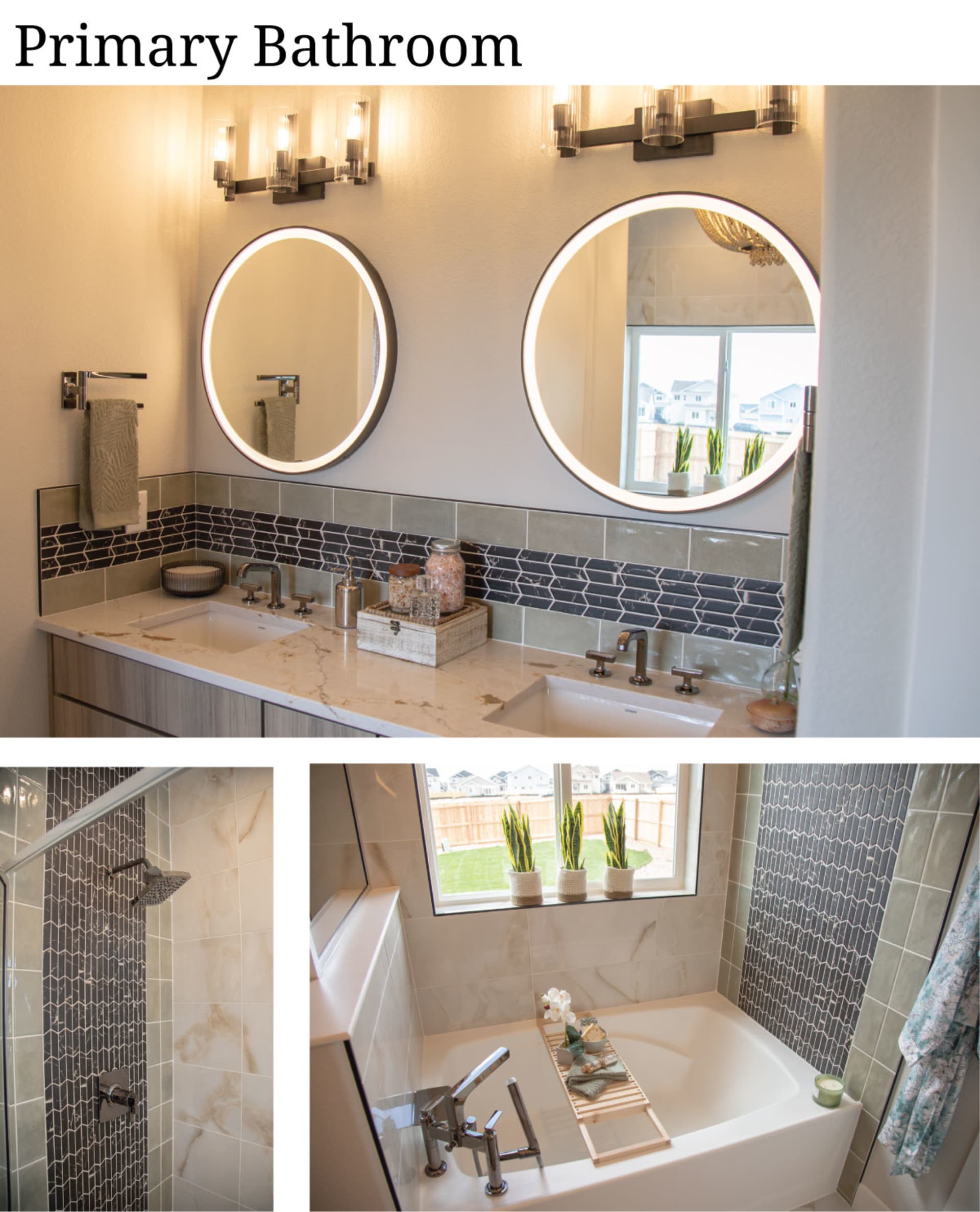
The foundational items in the primary bedroom come from the brand new Traverse City Collection. The Traverse City Panel Bedmight be my favorite piece and the whole home. It's got the perfect finish to match the wood textures in the home, and I really love the natural look of the woven leather headboard - great for adding more organic texture to complement the beaded chandelier above. The color of the headboard is also great for a touch of modern appeal, and because it complements the brown-around-black tiling in the primary bathroom!
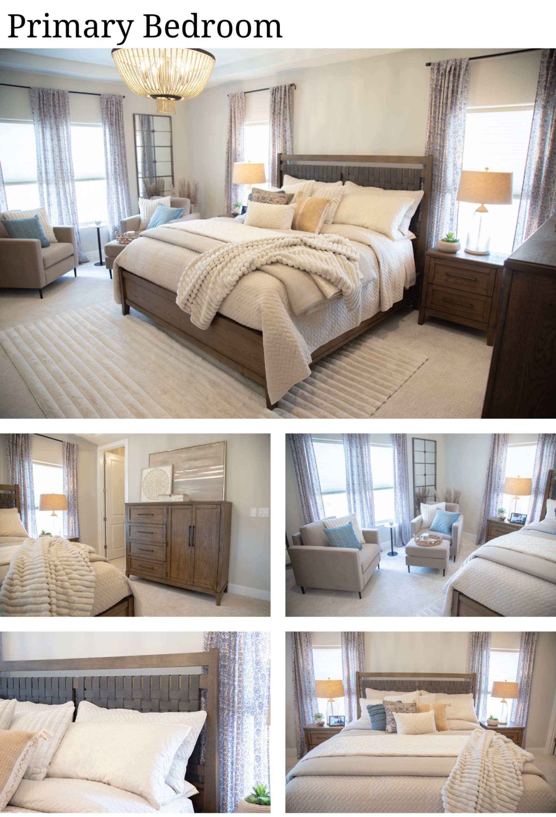
Once I placed the bed, the Traverse City Dresser, the Traverse City Chest, and two Traverse City Nightstands in the room, I thought it could use some more contemporary elements. The rug in the room is called the Channel Faux Fur Rug (Coming Soon to Furniture Row!), and it’s made of this irresistible Mondo-like fabric with these wide channels, so it blends contemporary and laid-back aesthetics in just the way I wanted. After the rug, pulled in the Nouvelle Velvet Chair and the Nouvelle Velvet Ottoman into the room because their clean-lined frames and stiletto feet give the space a chic mid-century feel, which, as you’ll see soon, was a fun way to nod to the design in the upstairs of the home.
The Office
In the office, I started with the Sedona Writing Desk and two Sedona Bookcases. These pieces lean to the rustic side of things, so they are fairly laid-back and natural-looking, but they also have a darker finish for that moody modern/urban color palette. I placed these foundational items on top of the Pavati Machine Washable Rugwhich also has a natural look with a tribal black-and-white pattern. To finish the room, I found the Emerson Office Chair, which is soft, comfortable, and casual, and I added additional seating with the contemporary Giada II Swivel Chair.
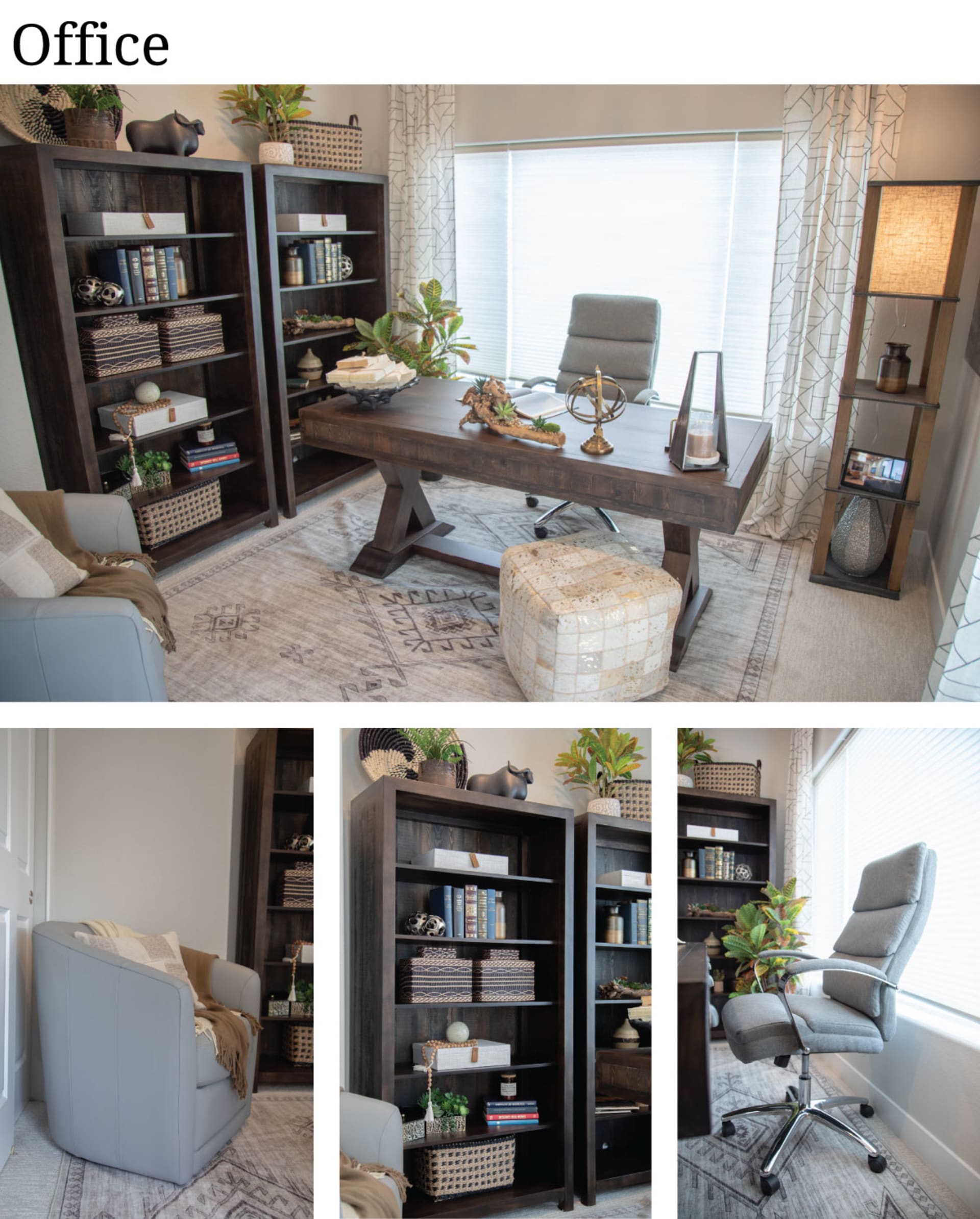
I decorated with accents from both contemporary and traditional styles, and then I used the Antares Shelf Floor Lamp (Coming Soon to Furniture Row!) for a final, functional rural touch.
Upstairs
When it came to the upstairs, I wanted to do something that was a little different to the main floor while still staying true to the overall theme of the home. The urban look and the contemporary look both love mid-century modern furniture at the moment, so I had the idea to give the upstairs a mid-century foundation.
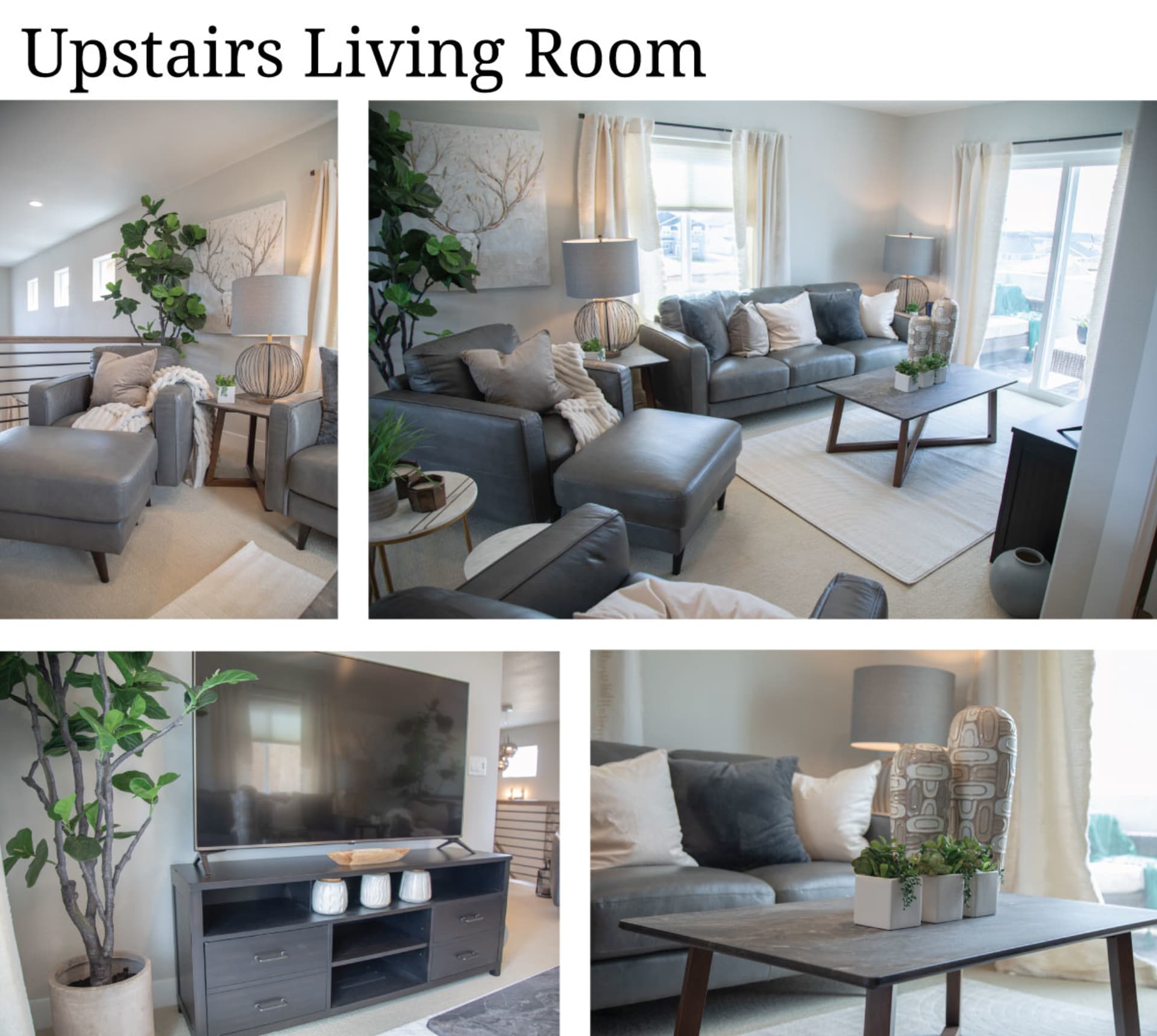
To lay-in those mid-century foundations, I started with the Tivoli Sofa and two Tivoli Chairs.
I really love the Tivolis because they have these tall track arms combined with flared, tapered wooden feet to create that dapper mid-century silhouette, plus they’re upholstered in genuine Italian leather so they are just a really great value…and really great looking!
To keep things relaxed, I added the Kent Coffee Table and the Kent End Table - both of which blend natural wooden tones with urban, angled metal bases. Next, I wanted the room to function as an entertainment space, so I needed a TV stand. I ended up using the Kingston TV Stand because it’s kind of a bridge between the Tivolis and the Kents - it’s simple with wooden tones and textures, but it showcases this darker gray finish with contemporary metal pull handles.
I finished the room with the Pure Arch Rug- a white-colored, channeled rug that I thought was really smart because it ties into the plush white rug in the primary bedroom!

One of the coolest features of the 2024 Dream Home in Colorado Springs is its upstairs balcony that we made into an "upstairs patio"! This sunny space is relatively compact so I wanted to find some outdoor seating that would fit, but that could also meet the unique style of this year’s home. The San Bruno 4 Pc. Outdoor Patio Setturned out to work wonderfully. The sofa and coffee table were the ideal size for the space and they have this low, mid-century style - then, I could also use the two chairs from the set to round out the covered patio space off of the dining area on the main floor!
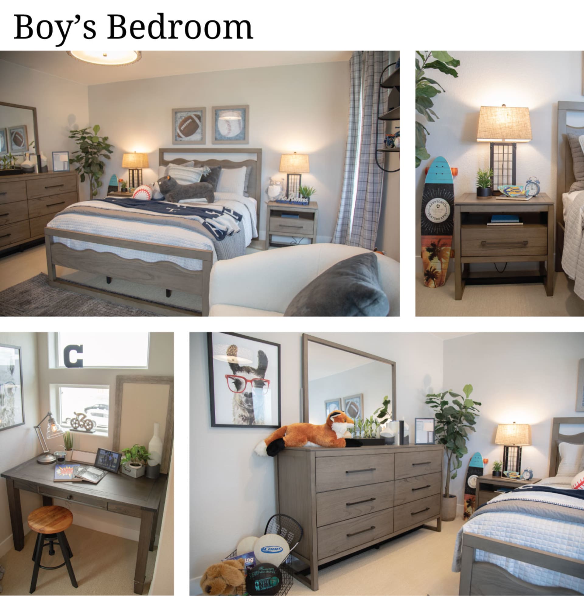
We planned for the upstairs bedroom to be a “Boys Room”, but I actually decorated it with an adult-sized collection. The LaVita Bedroom Collectionhas the perfect design elements for the home. The bed in this group comes in king and queen sizes, but it also comes in full and twin sizes too. The LaVitas showcase a different type of hardwood in a light colored finish - another tie-in to all natural, sun-faded wood tones throughout the rest of the home - and they sit atop modern sled style legs. And, the bed’s curvy cut-out headboard has just enough whimsey to work in a kids room.
For a touch of personality, I added in the Whiskey River Writing Desk and the Breakfast 22" Swivel Bar Stool to the nook beneath the window, both of which have a really fun retro look. And, I also threw in the Celine Accent Chair because its texture and curvy, compact size offer a nice contemporary contrast to the darker colors of the previous pieces.
Basement
The basement in this home is large, cozy, and it even has its own kitchen! It also has neutral-colored carpeted floors, which made the space lean heavily into the light-neutral color palette. So, my first thought was to find darker foundational pieces to contrast the neutral surroundings, but I also wanted to have fun and be casual in this great big room that just looks like it will be great for family memories.
Basement Living Room
To start the basement living room off, I first brought in the deliciously comfortable Luscious 5 Pc. Sectional and two Luscious Swivel Chairs. The Luscious Sectional is a stylish new sectional with incredibly deep seats and cushions you place at an angle, so it really encourages you to relax with a cool, casual look.
The Luscious is also great because it’s modular, so it can be configured to any space - we used it to fill out the corner of the room, but we could have put it together to make a big pit-style sectional, or we could have broken it apart to make little seating groups because you have, armless pieces, corner pieces, and it also has a matching ottoman.For a lot of families, that flexibility is huge.
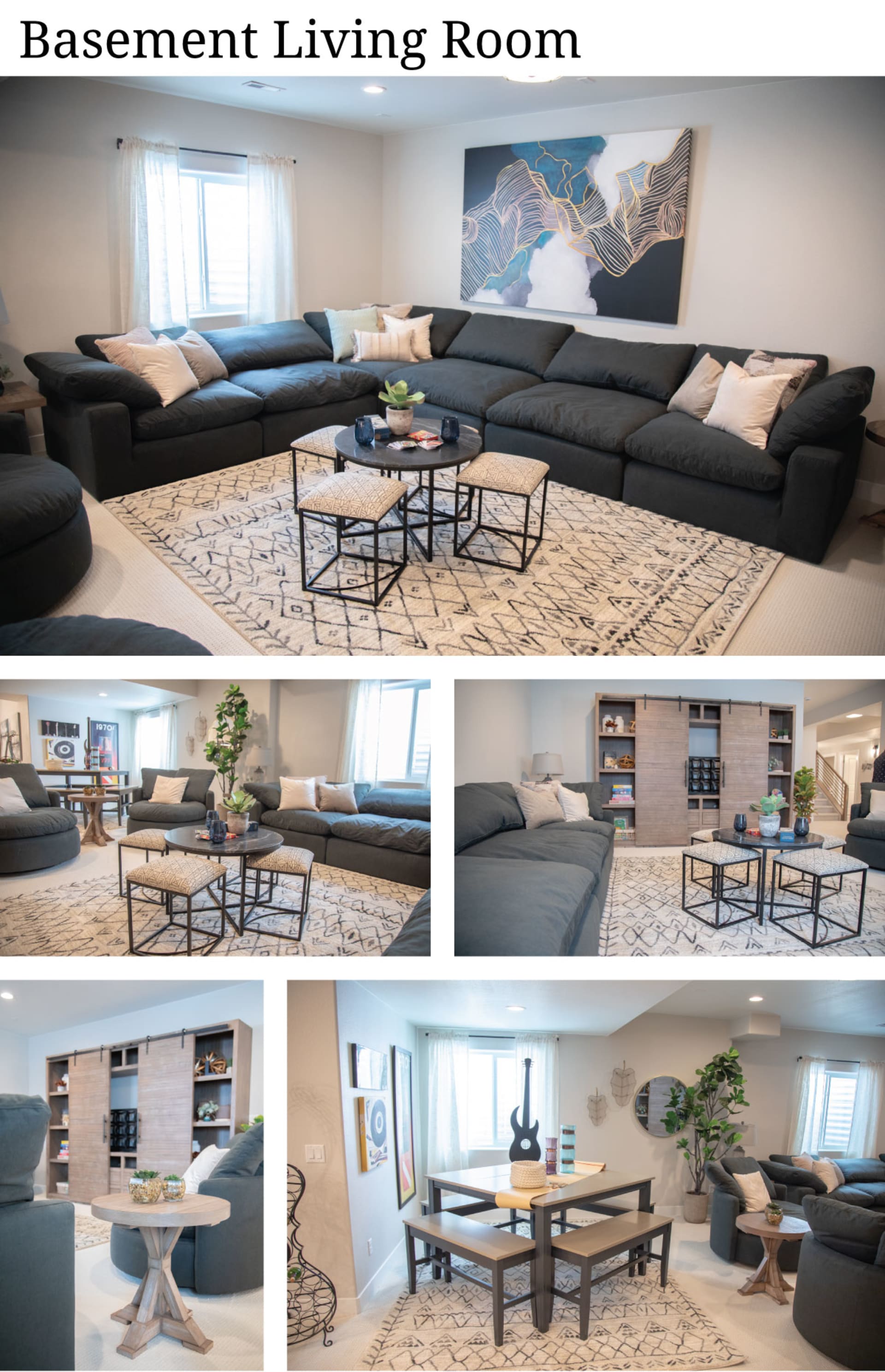
After I had the seating down, I looked at the space and felt the darker colors worked well for adding in the modern/urban contrast found throughout the rest of the home. Next, I wanted a few more pieces that instilled a rustic or natural look. I used the beautiful Theodore 5 Pc. Home Theater Wall as the primary occasional furnishing in the room and I also decorated with matching Theodore End Tables because they offer a variety of wooden tones and textures in yet another organic, light-colored finish.
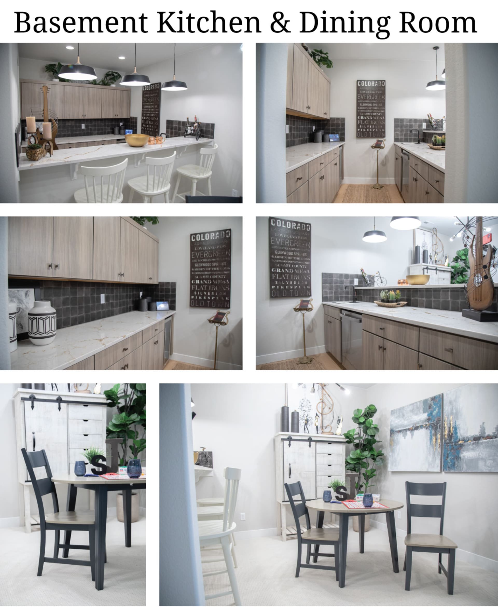
When it came to the small kitchen and dining nook in the basement, I thought it would be fun to do a playful nod to the upstairs dining spaces - but in reverse! Upstairs, we had a rustic dining set in the dining area paired with modern bar stools along the kitchen counter. So, down in the basement, I tried to do almost the opposite.
I used other items from the Merrill Creek Group - the Merrill Creek 3 Pc. Round Dining Room Set- to make a compact, modern dining space to the side of the kitchen, then I placed four white bar stools along the kitchen counter as a rustic counter point! The bar stools I used here were our Colors II Bar Stools, which I thought were perfect because they have this traditional Windsor design, but they can be ordered in a white finish that makes them feel coastal.
I finished this space with the Blackhawk Chest because it combines a rustic design with a bold, black-and-white palette - almost like it was made for this home.
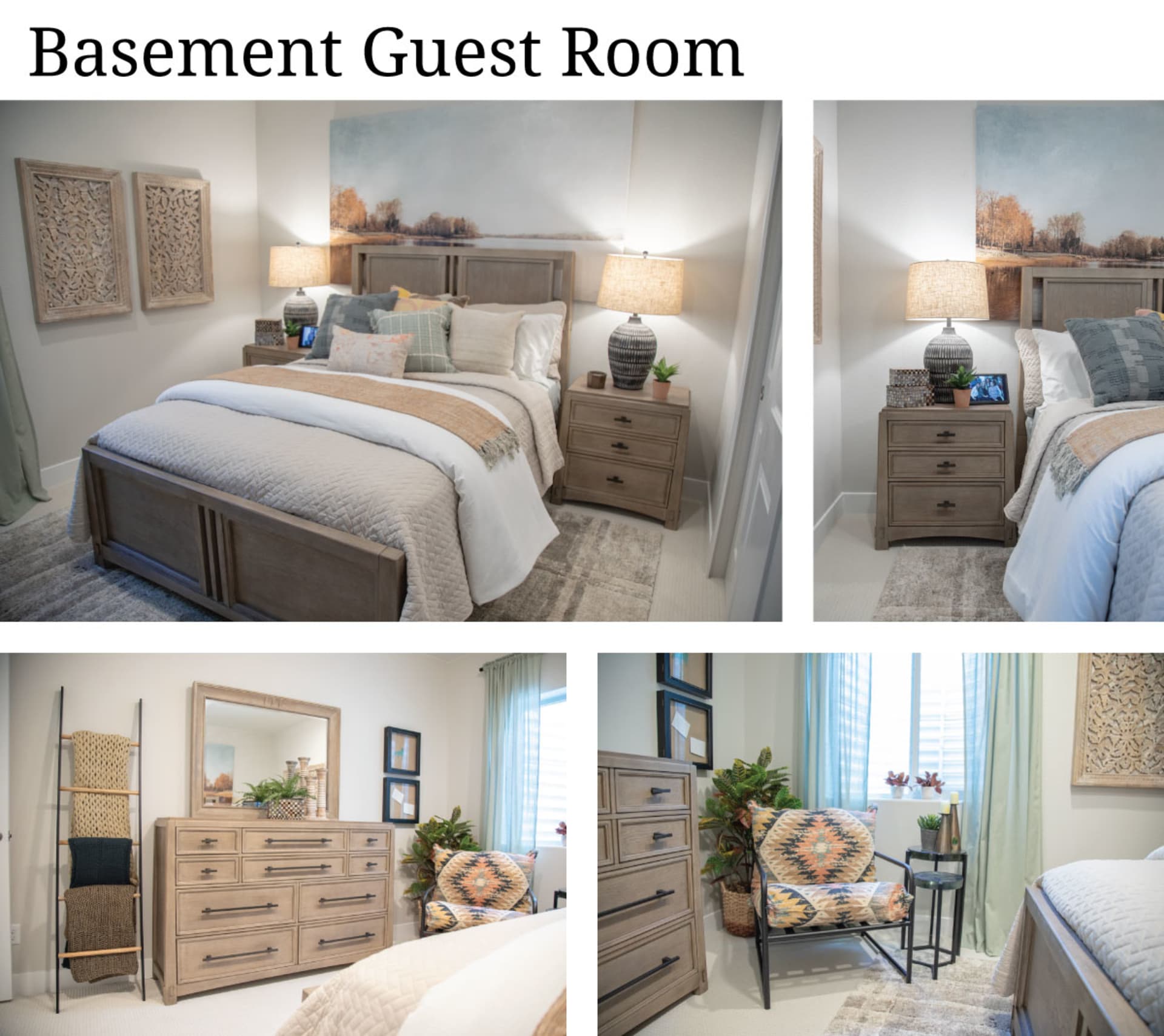
In the basement guest room, I started with the Frederick Panel Bedbecause it helps bring even more of the natural, sun-faded wood tones from upstairs down into the basement. The Frederick also has this square paneled headboard that reminded me of the Traverse City bed in the primary bedroom, so this and the other pieces in the Frederick bedroom collection, like the Frederick Dresser and the Frederick Nightstand, rounded out the room nicely.
While we were echoing the primary bedroom, I thought it would be cool to add some more boho flare down here, so I found the funky Maya Pillow Accent Chair and a few other boho-inspired accents to complete the look.
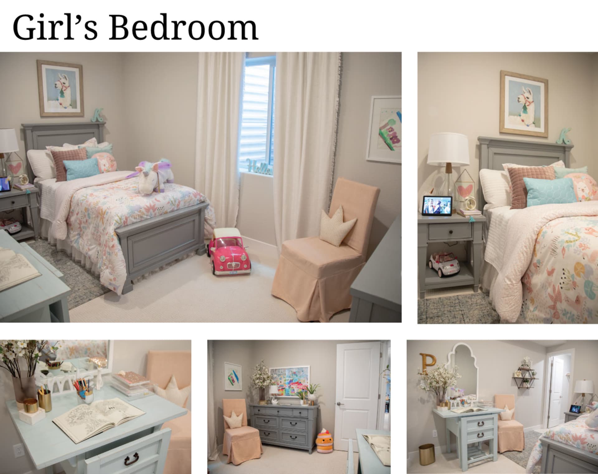
We used the final bedroom in the basement as our planned “Girls Room”. For this small space, I opted for more of a traditional feminine look, but with both warm and cool beach colors. I started with the Stoney Creek Panel Bed, the Stoney Creek Dresser, and the Stoney Creek Nightstandin gray, as well as the Calisa Rug in gray to instill a decidedly neutral base. Then, I finished the room with both coral-colored accents and aqua accents for a kid-ready beach look. A great finish to a home I absolutely LOVED designing!
Shop the Furniture in This Home
Final Thoughts
We hope you enjoyed learning more about the unforgettable style of the St Jude Dream Home in Colorado Springs! Purchase your tickets now so you don't miss out on this fantastic opportunity to potentially be the proud owner of this incredible home! We hope you’ll join us in supporting the invaluable research carried out by St. Jude Children's Hospital, and we hope to see you at the upcoming open house tours!